8.7 KiB
8.7 KiB
| title | component | label | description | source | prev |
|---|---|---|---|---|---|
| oh-knob-card - Knob Card | oh-knob-card | Knob Card | Display a knob in a card to visualize and control a quantifiable item | https://github.com/openhab/openhab-webui/edit/main/bundles/org.openhab.ui/doc/components/oh-knob-card.md | /docs/ui/components/ |
oh-knob-card - Knob & Rounded Slider Card
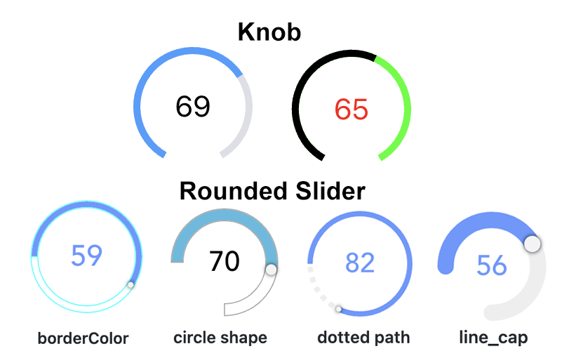
Display a knob or a rounded slider in a card to visualize and control a quantifiable item
Configuration
Use the advanced properties to change the appearance from a knob to a rounded slider.
Card
Parameters of the card
Title of the card
Footer of the card
Do not render the card border
Do not render a shadow effect to the card
Show the card outline
Knob & Rounded Slider
Parameters are passed to the underlying round-slider control
Item to control
Minimum value (default 0)
Maximum value (default 100)
Minimum interval between values (default 1)
Offset to be applied to the Item's state (e.g. Item state = 2; offset = 20; knob/rounded slider behaves as Item state would be 22)
Ignore the display state if available and always use the raw state.
If enabled, no commands are sent during sliding
Time to wait between subsequent commands in ms (default 200)
Time to wait before switching from displaying user input to displaying Item state in ms (default 2000)
Disable the slider (usually set via an expression since the value will not be displayed when disabled)
Visual size of the control in px (or % if responsive is true)
Size the control using percentages instead of pixels
Thickness of the arcs (default 18)
Angle of circle where the round slider should start (default -50); 0 is 9 o'clock; only if circleShape is not set
Angle of circle where the round slider should start (default -130); 360 is 9 o'clock; only if circleShape is not set
Indicates the circle shape to be render
Sets the shape of the end of the path; dotted path and line cap cannot be used together.
Length of dotted path segments (using css stroke-dasharray); dotted path and line cap cannot be used together.
Sets the border width of the slider (px value)
Sets the size of the slider handle (px value)
Sets the shape of the slider handle
Sets the border color of the slider; set borderWidth as well! (HTML value)
Sets the path color of the slider (HTML value)
Sets the range color of the slider (HTML value)
Sets the tooltip color of the slider (HTML value)
Inherited Properties
Properties are forwarded to the underlying vue-round-slider component, which means you can set these parameters. A compatibility layer ensures backward compatibility with the vue-knob-control component that was initially used.