22 KiB
| title | component | label | description | source | prev |
|---|---|---|---|---|---|
| oh-card - Card | oh-card | Card | The basic structure of all card widgets, providing title and footer and requiring a content slot | https://github.com/openhab/openhab-webui/edit/main/bundles/org.openhab.ui/doc/components/oh-card.md | /docs/ui/components/ |
oh-card - Card
The oh-card component provides the basic structure for all other card widgets.
It is providing a default implementation for both title and footer, and requires the content to be defined in the content slot.
Optionally, header and footer can be overwritten by providing the header and footer slots (see Slots).
oh-card also provides full control over its style as well as header, content and footer style (see Style).
Configuration
Card
Action
value=label format to provide a label different than the option.
Scene, Script or Rule to run
Object representing the optional context to pass. Edit in YAML or provide a JSON object, e.g. { "param1": "value1", "param2": { "subkey1": "testing", "subkey2": 123 } }.
Page to navigate to
Use a specific page transition animation
Page or widget to display in the modal
Configuration (prop values) for the target modal page or widget
Array of URLs or objects representing the images. Auto-refresh is not supported.Edit in YAML, e.g.
- item: ImageItem1
  caption: Camera
[ "url1", { "item": "ImageItem1", "caption": "Camera" } ]Objects are in the photos array format with an additional
item property to specify an item to view.
Configuration for the photo browser.Edit in YAML or provide a JSON object, e.g.
{ "exposition": false, "type": "popup", "theme": "dark" }See photo browser parameters (not all are supported). Group Item whose members to show in a popup Start analyzing with the specified (set of) Item(s) The initial analyzing period - dynamic or a predefined fixed period: day, week, month or year The initial coordinate system of the analyzer - time, aggregate or calendar (only time is supported for dynamic periods) Shows a dialog or sheet to ask for confirmation before the action is executed. Can either be a text to show in the dialog or a JSON object
{ type: "dialog", title: "Confirm", text: "Are you sure?" } or { type: "sheet", text: "Confirm", color: "green" }
Shows a toast popup when the action has been executed. Can either be a text to show or a JSON object including some of the supported parameters
The variable name to set
The value to set the variable to
Consider the variable value is an object and set the corresponding deep property within that object using a key syntax. Examples: user.name, user[0].address[1].street, [0], [0].label. The inner property and its parent hierarchy will be created if missing.
Tap Hold
value=label format to provide a label different than the option.
Scene, Script or Rule to run
Object representing the optional context to pass. Edit in YAML or provide a JSON object, e.g. { "param1": "value1", "param2": { "subkey1": "testing", "subkey2": 123 } }.
Page to navigate to
Use a specific page transition animation
Page or widget to display in the modal
Configuration (prop values) for the target modal page or widget
Array of URLs or objects representing the images. Auto-refresh is not supported.Edit in YAML, e.g.
- item: ImageItem1
  caption: Camera
[ "url1", { "item": "ImageItem1", "caption": "Camera" } ]Objects are in the photos array format with an additional
item property to specify an item to view.
Configuration for the photo browser.Edit in YAML or provide a JSON object, e.g.
{ "exposition": false, "type": "popup", "theme": "dark" }See photo browser parameters (not all are supported). Group Item whose members to show in a popup Start analyzing with the specified (set of) Item(s) The initial analyzing period - dynamic or a predefined fixed period: day, week, month or year The initial coordinate system of the analyzer - time, aggregate or calendar (only time is supported for dynamic periods) Shows a dialog or sheet to ask for confirmation before the action is executed. Can either be a text to show in the dialog or a JSON object
{ type: "dialog", title: "Confirm", text: "Are you sure?" } or { type: "sheet", text: "Confirm", color: "green" }
Shows a toast popup when the action has been executed. Can either be a text to show or a JSON object including some of the supported parameters
The variable name to set
The value to set the variable to
Consider the variable value is an object and set the corresponding deep property within that object using a key syntax. Examples: user.name, user[0].address[1].street, [0], [0].label. The inner property and its parent hierarchy will be created if missing.
Slots
You need to define either one of these two slots:
content: The default slot for content, which will then be rendered inside af7-card-contentelement.content-root: The slot for content that should be rendered directly inside the card, without any additional wrapping element. If this slot is defined, thecontentslot will be ignored, and you have to implement the handling ofconfig.contentStyleandconfig.contentClassyourself.
Optionally, you can define these slots:
header: The slot for the header content, which will replace the default header.footer: The slot for the footer content, which will replace the default footer.
Style
oh-card provides full control over the style of itself as well as the header, content and footer.
The card itself can be styled through the style and class config properties,
while the header, content and footer can be styled through the headerStyle, headerClass, contentStyle, contentClass, footerStyle and footerClass properties.
Example
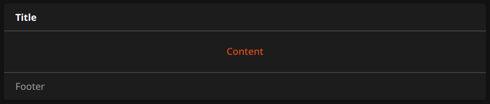
This card can be created using the following YAML definition:
component: oh-card
config:
  title: Title
  footer: Footer
  style: {} # Card style
  class: [] # Card classes
  headerStyle: {} # Header style
  headerClass: [] # Header classes
  contentStyle: {} # Content style
  contentClass: [] # Content classes
  footerStyle: {} # Footer style
  footerClass: [] # Footer classes
slots:
  content:
    - component: oh-button
      config:
        text: Content
Without using the oh-card component, the same card can be created by directly using the Framework7 components:
component: f7-card
config:
  style: {} # Card style
  class: [] # Card classes
slots:
  default:
    - component: f7-card-header
      config:
        style: {} # Header style
        class: [] # Header classes
      slots:
        default:
          - component: Label
            config:
              text: Title
    - component: f7-card-content
      config:
        style: {} # Content style
        class: [] # Content classes
      slots:
        default:
          - component: oh-button
            config:
              text: Content
    - component: f7-card-footer
      config:
        style: {} # Footer style
        class: [] # Footer classes
      slots:
        default:
          - component: Label
            config:
              text: Footer